 |
| Neiman Marcus 2011 |
I have noticed a trend. Subtle, but nonetheless its there. I don't even know what to call it. But this is what it reminds me of:
I remember in 8th grade art class, my instructor was teaching us about Matisse.

(Speaking of my art instructor, I have to give a shout out to W.L., who was my first mentor and such an integral part of my creative development. See Wally? I'm still noticing composition and design, and making my living from it and recalling where I first learned it!)
Anyways, we were supposed to recreate a Matisse painting, with colored chalk or pastels. That was the assignment. Okay, go.

I don't remember which one I chose; I do remember it had a round table in it, and maybe some plants and lots of pattern; similar to the one above, but not that one. It wasn't until I started sketching the layout, copying this master, that I understood the lesson to the assignment.

We've all seen Matisse's paintings a million times, or maybe at least thousands, right? But it wasn't until I tried to recreate one that I finally understood what makes his art so unique. Besides the layering, besides the colours, besides the patterns, and besides the 'everyday subjects brought to life', it was HIS PERSPECTIVE.
There is a natural Perspective in our vision that artists re-create on a 2-dimensional canvas to make it appear realistic.


Now, when you look at a Matisse painting, what do you notice? This is what I found out when I tried to copy his art on paper, at age 14. He skewed the perspective on canvas. That rug in the foreground... Our eyes naturally see the part farthest part as smaller than the end nearest us, but Matisse paints it all the same size. There is no delineation between near and far.
And now, looking at Matisse's other paintings, plates and platters are all the same size, like an oval disc cut out and placed atop the canvas -- instead of being drawn to scale, or correct perspective. A tabletop in the painting that was my assignment is where I noticed this lack of perspective. And trust me, it's harder than it looks to go AGAINST your eye's natural view, and paint in 2-dimensions.
This must be ONE reason Matisse is a master of art. Did he do it on purpose? Was it accidental? I happen to think it was on purpose. It is that perfect balance of naiveness without being contrived. It's like this: When a child paints a picture, and they do it from their head without thinking and it's GENIUS. Purely magical.
BUT when an adult tries the same thing, it comes across as CONTRIVED. You can tell the difference. Similar to personalities. Someone who is just 'cool' without trying, and someone who tries SO hard at being cool, that it is contrived and backfires.
So, I always wonder, did Matisse do this from a sort of naiveté OR did he know exactly what he was doing, wanting to mess with our perception, but do it SO well that it didn't come across as contrived?
ALL OF THIS brings me back to my original point, and title of my post: The New Direction of Editorial. It hit me, as I was looking at images throughout the web and magazines, created by stylists and stores alike: They are changing their perspective on these collages. Everything is being shot from ABOVE, with a lack of 'one point perspective'.

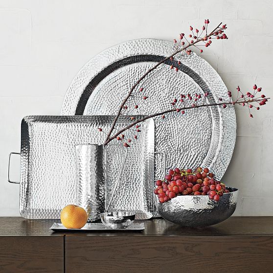
While these images of place settings, both from West Elm, are shot from above and looking down on the subject...

... I remember, and they still do this, them shooting scenes straight on, looking AT objects, instead of DOWN at them (seen below).
 |
| above and below, both West Elm |
Can you see the difference now??

And it's extended itself to every editorial shot...
 |
| above and below: Styled by the Blue Issue for ON Magazine Shop 2010, Photographed by Park & Sabine |
FASHION SPREADS NOW: LOOKING DOWN

 |
| above and below: Neiman Marcus 2011 |
FASHION SPREADS HOW WE KNOW THEM: LOOKING AT

And in the same catalogue from Neiman Marcus, is some inspiration boards, shown how we would normally look at a wall:


And how I am seeing them more and more: FROM ABOVE:

 |
| THE COATHANGERS by J TRAV |
Even Kelly Wearstler, who is sets the trends, has images in this editorial style:
 |
| KWID for Sferra |
 |
| KWID for The Rug Company |
 |
| above & below: KWID for Sferra |

And my FAVE, DIANE VON FURSTENBERG shows here home goods line in the same style, below:

WHAT DO YOU THINK, Am I on to something?
It's just one of those 'je ne sais quoi' things that stood out to me.
And if it makes me go back and reminiscence about 8th grade Matisse, then for that alone, I am glad.