Featured in...

Better Homes & Garden's Storage Magazine
Spring 2011


The owners of this bathroom have a beautiful house, and this bathroom is no exception. It is peaceful and classic.


I used the homeowner's giant clamshell from their Dining room as a caddy for bath products in their shower.


I had a favourite local monogrammer put the wife's monogram on the yummy Pottery Barn towels and the husband got a matching monogram on his hand-towel.


This is his vanity and a peek into the bedroom. I won't even tell you how many different "whites" this bedroom was painted days before the photo-shoot. In fact, the last coat went on 8 hours before shooting began. And bedding was sent expedited shipping from Italy. Nothing like a deadline to get a project finished!


A drawer filled with my FAVOURITE scent Acqua di Parma Colonia. I used The Container Store's plastic organizers for the inside of all the bathroom drawers. 

If you look closer, or look at the image below, you can see a teeny tiny jar filled with cufflinks. These are actually salt cellars, that I often use as containers for small jewelry items, and do so myself. This exact same porcelain container/salt cellar is available at our store here.


This cute vanity stool comes from a local shop Mary Cates & Co. I used a pillow sham and had a local drapery workroom that specializes in slipcovers make it into a slipcover for the stool. 


I personally like to keep all my travel toiletries already put into travel sized plastic bottles, labeled and ready to go in the appropriate plastic bag. I did the same for this homeowner, so when they travel all they have to do is literally grab the bag and go. It's all ready and airplane safe. 

Instead of putting the cosmetics in just plastic organizers in her vanity drawer, I lined a wicker organizer with the plastic containers to make it look prettier. 

BEHIND THE SCENES:


This is the floor plan I sent in to the Magazine so they could visualize the layout. They used it for their illustrated version above.


The magazine editor looks at the scout shots sent in via email and uses them to plan the shoot with specific directions for the photographer. She basically comes up with a story-board first so there is a plan in which to use.


This is what the rest of the bathroom looked like, surrounding the area we were shooting.


One vanity counter while the other one was being photographed. Most of this is the homeowners stuff they actually use, I just had to figure out a better storage solution in which to display them and organize it.


The adjoining bedroom was kind of a holding ground for "stuff".


Since a portion of the bed was in the shot, I ironed and ironed the duvet cover so that there was NOT ONE wrinkle to be found. I guess it's that German heritage that drives me to an insane amount of details and perfection. It makes me crazy though. I am sure I make everyone else crazy too with it!


It was an exhausting 24 hours. The home-owner's dog Mac had the right idea in just sleeping through it.


The photographer for the shoot was Alise O'Brien from St. Louis. She is amazing. The image above and below are two shots that were not included in the publication but I think they are beautiful.

 I used the home-owner's grandmothers sterling ladle for their bath salts. I do the same thing in my bath at home. I always try and find a way to repurpose objects, especially family pieces so you can use them on a daily basis. I hate to think of these gorgeous and well loved things sitting locked in a drawer somewhere. 

If you want to try this look at home, you can go to any discount store and purchase big glass apothecary jars, and fill them with OUR yummy bath salts available here.


On her vanity, I used a vintage Ironstone platter usually used for coffee as a small tray to hold her jewelry. Demi-tasse cups make perfect containers for Q-tips and little abalone shells are a great spot to place your earrings. The exact shell that I used is available as a pair here in our store, Shop Curio. 

 The photo process for interiors is a LOT of hard work, and it is a wonderful feeling to have special friends drop in for support and help from everyone, and best of all great homeowners.

My most sincere thank you goes out to Bonnie. You're the best!

A Study in Giza

No, Not a STUDY IN GIZA, EGYPT but a study IN Giza. The fabric Giza of course!

I am wrapping up some projects, and that is exciting to me. Not because they are almost finished, but because this is where I really enjoy the design process. Seeing a space really transform. Through hard work, cheers, and tears, push-backs and price-changes, seeing a room come alive makes the whole thing exciting.


Such is the case for a family I have been designing for the last 11 months. We are coming close to completing several rooms, and I thought I'd share one that is almost finished. I LOVE it and I think it really speaks of the homeowner and his likes. That is most important anyways~!

The library one month after move-in

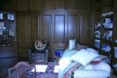
This study is a wonderful space, completely panelled in wood with high ceilings and clerestory windows. When this family moved in to this new house 12 months ago, the homeowner told me he planned on really using this study as his home office. So I wanted to make sure in this case form followed function. 


Right away, I knew I wanted a warm red colour for the curtains and accents. I didn't want super traditional, but it needed to be classic. When we found Andrew Martin's "Giza" in red, it was PERFECT.


Not only is this fabric have a wonderful hand to it (feels like a silk/linen blend but is actually 65% rayon, 35% ramie) but it has an exotic feel to it, which was instantly the right fabric for this space.  The homeowner had recently been to Africa and loves to travel. So a ikat-style pattern in rich colours from the UK was spot on! (Also, look for this fabric in a spread in this months Elle Decor -- it takes on a whole other feel. So transitional and versatile!


Speaking of Africa, I also knew we had to incorporate some of Scalamandré's Le Tigre silk velvet. This is one of my all time favourite fabrics. It is a classic. But it is expensive. I find that there are a few sellers on eBay who sell pillows already made in this fabric, so you don't need to purchase the minimum yardage if you want just one pillow, which where I bought this one.

Speaking again of the homeowner's trip to Africa, he had requested to use some of his photographs he took on the trip. What a great idea, because they were truly works of art. 


I asked him to pick his favourite 4 photos, and went from there. I took them to my favourite framer and picked a linen matte board, a gold fillet and a heavy gold and ebony frame. On these I made sure to use the new conservation glass so it was UV protected. 


I tried to keep them all the same size once framed. Now where to put them? They are rather big.

Before, shortly after they moved in
This wall opposite the window was the best location for the photographs. I knew I didn't want to line the entire wall in photos, because that would of overwhelmed the room, My solution was to search for a large mirror to put on the same wall, and place the frames around it.


Oh, I found the most wonderful one at White Elephant Antique Warehouse in Dallas. It is a very large gilt mirror with ghost mirror, circa late 19th century. I was worried about presenting something so old, formal and gold to this client, but he was totally on board. And I am so glad he was because not only does it set the perfect environment for the photographs, it reflects the window opposite it so there is double sunlight in the room.


To add to the traveling spirit of this library, is the trunk that belongs to the homeowner. It couldn't be more perfect for here. Also, he is an avid rug collector and we found this rich oriental rug at the Dallas Design Centre with his wife. Actually, I think she is the one who found it on her own!


What we all decided is that not only did the space need to be warm and cozy and reflective of the owner, it needed to meet his needs and function as a true work space. It needed a large desk, and a large sofa for television watching. Space was not an major issue. But instead of just having a sofa, I wanted to incorporate enough room for two more chairs. I found two basic upholstery frames that were somewhat modest in size, but deep enough to be comfortable. We covered them in a textural linen by Holly Hunt's Great Plains and put them on swivels. Now this space is conducive to conversation and entertaining.


On the desk, we found this great vintage trophy which I thought was fun since the owner is an avid athlete and has competed in marathons and recently the Ironman Triathlon. When I found these mineral obelisks at a showroom sale, I knew they would look wonderful in this eclectic library.


Well, this was supposed to be a little bit different here. The homeowner had a blue & white porcelain lamp that we were going to find a new shade for. Well, it was securely in my front seat until I opened the passenger door in my garage and .....*splat. Broken to pieces on my garage floor. That is a bad feeling when that happens to someone else's object. So I took a couple months to find one closest to hers and purchased a pretty linen shade and some braided trim and hopefully it looks just as good as the original. I think it's pretty lovely, broken pieces not considered. 

Hope you enjoyed the fantastic voyage! 
(intro to Coolio's Fantastic Voyage... ♪slide slide slippity slide ♫)
Related Posts Plugin for WordPress, Blogger...