Showing posts with label Texas. Show all posts

SHOPPING CENTER LIKES

Yesterday, at our neighborhood shopping village, I had 5 spare minutes before going to an appointment there. I parked right in front of the Stella McCartney boutique, got out, and ran back to my car to grab my camera. Every time I walk by her store, I MARVEL at the way the floors are laid in there. And this time I was going to take a snapshot of it.


The floors appear to be laminate wood, but could possibly be real wood. But the boutique designers made it unique by dying several of the planks different shades of pink, then laying them in a variegated zig-zag/chevron pattern. 

At the entrance of the door, the color is intense. As you enter the store, it fades out. 

And speaking of door, isn't it just fabulous?


Next to Stella McCartney is the Tory Burch boutique. This one has the best door in the village. Bright, heavy, bold and the handle is her logo. 


The door of course is stunning, but the way it fits in the arch of the architecture above is so cool. 


And speaking of architecture, our neighborhood shopping village was the FIRST outdoor Shopping Center in the United States! But that in itself deserves its own post. I'll get to work on that asap. I promise, the architecture and history is unique - and not to just Texas!

SHOPPING CENTER LIKES

Yesterday, at our neighborhood shopping village, I had 5 spare minutes before going to an appointment there. I parked right in front of the Stella McCartney boutique, got out, and ran back to my car to grab my camera. Every time I walk by her store, I MARVEL at the way the floors are laid in there. And this time I was going to take a snapshot of it.


The floors appear to be laminate wood, but could possibly be real wood. But the boutique designers made it unique by dying several of the planks different shades of pink, then laying them in a variegated zig-zag/chevron pattern. 

At the entrance of the door, the color is intense. As you enter the store, it fades out. 

And speaking of door, isn't it just fabulous?


Next to Stella McCartney is the Tory Burch boutique. This one has the best door in the village. Bright, heavy, bold and the handle is her logo. 


The door of course is stunning, but the way it fits in the arch of the architecture above is so cool. 


And speaking of architecture, our neighborhood shopping village was the FIRST outdoor Shopping Center in the United States! But that in itself deserves its own post. I'll get to work on that asap. I promise, the architecture and history is unique - and not to just Texas!

DALLAS HOMES: BED & BATH

Ahhh-ha, Here we are with the last of my picks of beautiful Dallas spaces from DHome Magazine. For those of you who subscribe via email, I am sorry for the bombardment to your inbox. Hopefully not everyone will remove themselves! !

Moving  through the house, we come to the bedrooms and baths. The retreats. Here are some lovely examples of the subtleness and sophistication that does reside in Dallas. Not everything here is Big and LOUD!


Photography by Manny Rodriguez (he's great!)


Photography by Manny Rodriguez 
 The large drumshade chandelier and mirrors on the wall are all from Neiman Marcus. I like the off-balance of the room, the scale of the headboard is so small in comparison, yet somehow it all works.


Photography by Stephen Karlisch


Photography by Manny Rodriguez 
 A great solution as to where to put a bed, or create a space, in a big open room with windows for walls. I am not usually a fan of furniture set at angles, but I definitely like it here. Also, the tufting wall/headboard is fantastic. Headboard, bench, and Sabrina chair all from Jan Showers Collection. Chandelier by Vaughan, Lamps from Ralph Lauren.


Photography by Aimee Herring
 This has that elegant touch, probably because of the gorgeous fabric on that headboard, designed by Jan Showers. I've used that exact sunburst mirror before, and it is a classic in my opinion and inexpensive. I like the tape design on the corners of the long boudoir pillow. 


Photography by Aimee Herring
 This is a great example of how to incorporate vintage or heirloom linens into a space, without it looking stodgy. This bed has a 19th c. Italian macrame bedspread laying on top, but with a modern shaped headboard (designed by Ken Blasingame) it looks fresh and lovely!


Photography by Stephen Karlisch
 That gorgeous showstopper of a headboard? A 19th Century Portuguese fragment. The room has bits from all parts of the globe: The chandelier, France. The lamps, American. Mixed with a large suzani textile, this all works.


Photography by Danny Piassick (a favourite of mine!!)


Photography by Manny Rodriguez
A dark wood paneled room that isn't traditional at all. Instead this is a guestroom, and that is a MURPHY BED! 


Photography by Stephen Karlisch
The above bath and below both belong to the same home, and what do I love most about them? Those FLOORS! But that bold yellow painting hanging on the white-squared tile wall is fabulous too. Not to mention the vintage lucite vanity bench below. What don't I like about these baths?


Photography by Stephen Karlisch


Photography by Manny Rodriguez
And simplicity here brings peace and serenity. Or as Frank Costanza & Lloyd Braun both call it, SERENITY NOW!!!! SERENITY NOW!

DALLAS HOMES: BED & BATH

Ahhh-ha, Here we are with the last of my picks of beautiful Dallas spaces from DHome Magazine. For those of you who subscribe via email, I am sorry for the bombardment to your inbox. Hopefully not everyone will remove themselves! !

Moving  through the house, we come to the bedrooms and baths. The retreats. Here are some lovely examples of the subtleness and sophistication that does reside in Dallas. Not everything here is Big and LOUD!


Photography by Manny Rodriguez (he's great!)


Photography by Manny Rodriguez 
 The large drumshade chandelier and mirrors on the wall are all from Neiman Marcus. I like the off-balance of the room, the scale of the headboard is so small in comparison, yet somehow it all works.


Photography by Stephen Karlisch


Photography by Manny Rodriguez 
 A great solution as to where to put a bed, or create a space, in a big open room with windows for walls. I am not usually a fan of furniture set at angles, but I definitely like it here. Also, the tufting wall/headboard is fantastic. Headboard, bench, and Sabrina chair all from Jan Showers Collection. Chandelier by Vaughan, Lamps from Ralph Lauren.


Photography by Aimee Herring
 This has that elegant touch, probably because of the gorgeous fabric on that headboard, designed by Jan Showers. I've used that exact sunburst mirror before, and it is a classic in my opinion and inexpensive. I like the tape design on the corners of the long boudoir pillow. 


Photography by Aimee Herring
 This is a great example of how to incorporate vintage or heirloom linens into a space, without it looking stodgy. This bed has a 19th c. Italian macrame bedspread laying on top, but with a modern shaped headboard (designed by Ken Blasingame) it looks fresh and lovely!


Photography by Stephen Karlisch
 That gorgeous showstopper of a headboard? A 19th Century Portuguese fragment. The room has bits from all parts of the globe: The chandelier, France. The lamps, American. Mixed with a large suzani textile, this all works.


Photography by Danny Piassick (a favourite of mine!!)


Photography by Manny Rodriguez
A dark wood paneled room that isn't traditional at all. Instead this is a guestroom, and that is a MURPHY BED! 


Photography by Stephen Karlisch
The above bath and below both belong to the same home, and what do I love most about them? Those FLOORS! But that bold yellow painting hanging on the white-squared tile wall is fabulous too. Not to mention the vintage lucite vanity bench below. What don't I like about these baths?


Photography by Stephen Karlisch


Photography by Manny Rodriguez
And simplicity here brings peace and serenity. Or as Frank Costanza & Lloyd Braun both call it, SERENITY NOW!!!! SERENITY NOW!

DALLAS HOMES: DINING ROOMS

FOLLOWING my earlier posts on lovely Dallas Living Rooms and Entryways, Here comes some more sophisticated Dallas rooms: Dining. 


Photography by Aimee Herring
How can you not love the drama of this dining area? The plumed white plaster sconces against matte black walls, the softness of the blue silk on the dining chairs in contrast with bold Mastercraft brass host chairs, and mixing it up with some Napoleon III French Ormolu candelabras from Paris atop a custom designed Traditional inspired table by Woods & Butler.


Photography by Stephen Karlisch
This is probably one of the most loved dining rooms that DHome Magazine has ever featured. I don't know how you couldn't remember this room! Published in 2006, it was on the cover of the magazine. Very Federalist meets the Nouveau South. A true testament to the power of colour and paint!!


Photography by Stephen Karlisch
This dining room belongs in a 1940's Federal-style home. The stone table is by Michael Taylor, and although the art and furniture itself is classical, it looks fresh and modern with the choice of floor covering, fabric colours and lighting. 


Photography by Stephen Karlisch
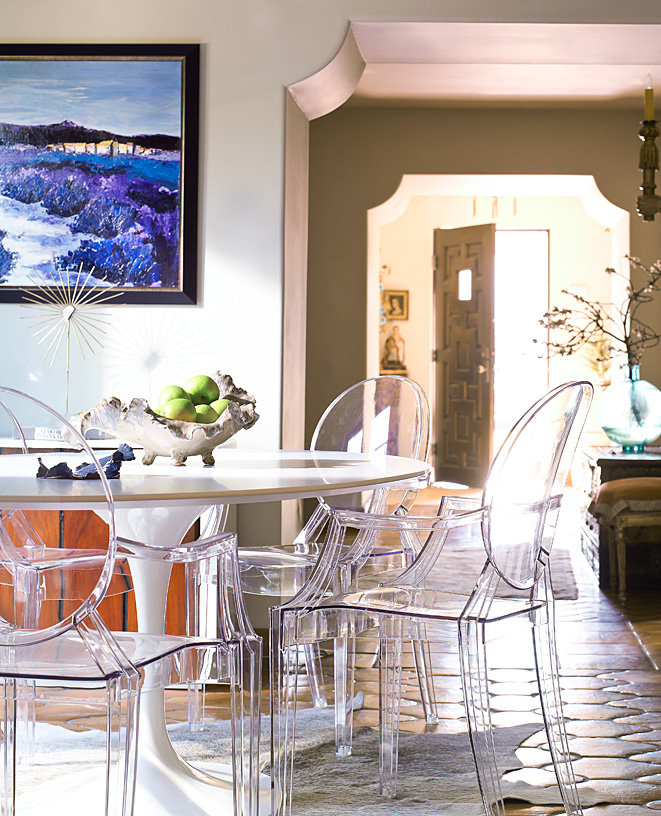
I love spaces where a mix of styles co-exist peacefully. Note in the room above: A Knoll Saarinen table and the Kartell Ghost chairs sitting on a cowhide rug, atop Mexican tiled floors. 


Photography by Stephen Karlisch
This is a great example of custom art glass and how it can change a room. The glass wall was created by Bowman Glass, and enhanced with black modern/classic chairs by Kerry Joyce from David Sutherland Showroom. That Satin Glass chandelier is a nice elegant contrast to the black lines and designs around the room. 


Photography by Stephen Karlisch
On the above image, If you look real hard, you can see the console table agains the wall, slipcovered in Fortuny fabric.


Photography by Stephen Karlisch
This is a formal room, and although I am not personally fond of the fabric on the banquette, I do love the whole look together. Banquettes are the bomb. (Sorry, is that phrase so over now? What is the new saying? Where is my middle-school walking urban dictionary when I need him?) Antiqued mirror panels: timeless. Orientalist painting: love it. Very cozy and rich!


Photography by Manny Rodriguez
This last room, but certainly NOT least, belongs to the owner of Nest, here and Dallas, and Bel'Invito - a gorgeous engraved stationery company. I had considered putting antiqued mirror on my ceiling in our conference room, having not even seen this room before that, and it does look fantastic! Our glass provider would not do it, for safety purposes, but apparently they now make a plexiglass version that looks just like antiqued mirror. I wonder if that is what this is?

DALLAS HOMES: DINING ROOMS

FOLLOWING my earlier posts on lovely Dallas Living Rooms and Entryways, Here comes some more sophisticated Dallas rooms: Dining. 


Photography by Aimee Herring
How can you not love the drama of this dining area? The plumed white plaster sconces against matte black walls, the softness of the blue silk on the dining chairs in contrast with bold Mastercraft brass host chairs, and mixing it up with some Napoleon III French Ormolu candelabras from Paris atop a custom designed Traditional inspired table by Woods & Butler.


Photography by Stephen Karlisch
This is probably one of the most loved dining rooms that DHome Magazine has ever featured. I don't know how you couldn't remember this room! Published in 2006, it was on the cover of the magazine. Very Federalist meets the Nouveau South. A true testament to the power of colour and paint!!


Photography by Stephen Karlisch
This dining room belongs in a 1940's Federal-style home. The stone table is by Michael Taylor, and although the art and furniture itself is classical, it looks fresh and modern with the choice of floor covering, fabric colours and lighting. 


Photography by Stephen Karlisch
I love spaces where a mix of styles co-exist peacefully. Note in the room above: A Knoll Saarinen table and the Kartell Ghost chairs sitting on a cowhide rug, atop Mexican tiled floors. 


Photography by Stephen Karlisch
This is a great example of custom art glass and how it can change a room. The glass wall was created by Bowman Glass, and enhanced with black modern/classic chairs by Kerry Joyce from David Sutherland Showroom. That Satin Glass chandelier is a nice elegant contrast to the black lines and designs around the room. 


Photography by Stephen Karlisch
On the above image, If you look real hard, you can see the console table agains the wall, slipcovered in Fortuny fabric.


Photography by Stephen Karlisch
This is a formal room, and although I am not personally fond of the fabric on the banquette, I do love the whole look together. Banquettes are the bomb. (Sorry, is that phrase so over now? What is the new saying? Where is my middle-school walking urban dictionary when I need him?) Antiqued mirror panels: timeless. Orientalist painting: love it. Very cozy and rich!


Photography by Manny Rodriguez
This last room, but certainly NOT least, belongs to the owner of Nest, here and Dallas, and Bel'Invito - a gorgeous engraved stationery company. I had considered putting antiqued mirror on my ceiling in our conference room, having not even seen this room before that, and it does look fantastic! Our glass provider would not do it, for safety purposes, but apparently they now make a plexiglass version that looks just like antiqued mirror. I wonder if that is what this is?
Related Posts Plugin for WordPress, Blogger...